 |
 Guggenheim
Museum Bilbao Guggenheim
Museum Bilbao
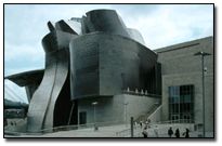
Designed by the North American architect Frank O. Gehry, this
unique Museum built on a 32,500 square meter site in the center
of Bilbao represents an amazing construction feat. On one side
it runs down to the waterside of the Nervión River,
16 meters below the level of the rest of the city of Bilbao.
One end is pierced through by the huge Puente de La Salve,
one of the main access routes into the city.
The perfect setting: architecture for art´s sake
 The building itself is an extraordinary combination of interconnecting
shapes. Orthogonal blocks in limestone contrast with
curved and bent forms covered in titanium. Glass curtain
walls
provide the building with the light and transparency
it needs. Owing
to their mathematical complexity, the sinuous stone,
glass, and titanium curves were designed with the aid of
computers.
The glass walls were made and installed to protect the
works of art from heat and radiation. The half-millimeter
thick "fish-scale" titanium
panels covering most of the building are guaranteed to
last one hundred years. As a whole, Gehry's design creates
a spectacular,
eminently visible structure that has the presence of a
huge sculpture set against the backdrop of the city. The building itself is an extraordinary combination of interconnecting
shapes. Orthogonal blocks in limestone contrast with
curved and bent forms covered in titanium. Glass curtain
walls
provide the building with the light and transparency
it needs. Owing
to their mathematical complexity, the sinuous stone,
glass, and titanium curves were designed with the aid of
computers.
The glass walls were made and installed to protect the
works of art from heat and radiation. The half-millimeter
thick "fish-scale" titanium
panels covering most of the building are guaranteed to
last one hundred years. As a whole, Gehry's design creates
a spectacular,
eminently visible structure that has the presence of a
huge sculpture set against the backdrop of the city.
A new urban center
People coming from the calle Iparraguirre, one of the main
streets bisecting the center of Bilbao diagonally, are
led directly to the main entrance; the idea was to bring
the
city right to the doors of the building. A broad flight
of steps takes pedestrians down to the Museum hall although
descending flights of stairs are not a frequent feature
of
institutional buildings. This is an inspired response to
the differences in height between the level of the river
and the level of the city center. It also enables a building
with a surface area of 24,000 square meters and more than
50 meters high to be slotted into the city landscape without
it towering over the neighboring buildings.
A city within another
Visitors passing through the hall to the exhibition areas
come immediately to the atrium, the real heart of the Museum
and
one of the most idiosyncratic features of Gehry's design,
which has a sort of metal flower skylight at the top that
allows a stream of light to illuminate the warm, inviting
space. From the Atrium, the visitor is given the opportunity
to access a terrace covered by a canopy supported by a
single stone pillar. The canopy serves a function (better
appreciated
perhaps from the other bank of the river, which offers
observers an excellent view of the entire rear façade of the
Museum) that is both protective and aesthetic at one and
the same time. The broad flight of stairs that goes up to
the sculptural tower, conceived as a device to absorb and
integrate the Puente de La Salve into the overall architectural
scheme of the building, is also a public access way that
connects pedestrians with the rest of the city.
Exhibition galleries are organized on three levels around
the central atrium and are connected by a system of curving
walkways
suspended from the roof, glass elevators and stair turrets.
All in all, a spectacular vision that one critic has described
as a metaphorical city, where the panels of glass that cover
the elevator-well evoke the scales of a fish that leaps and
spins, the walkways that climb the interior walls are like
vertical motorways, and the plaster curves crowning the atrium
suggest the molded ribbing of a drawing by Willem de Kooning.
In short, a glimpse of artifice in architectural design taken
to its uttermost limits.
The space of art
Eleven thousand square meters of exhibition space are distributed
in 19 galleries. Ten of these galleries have an almost
classical orthogonal look and can be identified from outside
by their
stone finishes. Nine other, irregularly-shaped galleries
present a remarkable contrast, and can be identified from
outside by their unusual architecture and the covering
of titanium. By playing with volumes and perspectives,
these
galleries provide huge interior spaces that somehow manage
not to overwhelm the visitor. Large-scale artworks are
housed in an exceptional 30 meter wide, 130 meter long
gallery free
of columns and with flooring specially prepared to cope
with the comings and going of visitors and museum staff,
as well
as the sheer weight of the works on display there. Seen
from the outside, this gallery slides underneath the Puente
de
La Salve and runs up against the end of the tower that
embraces the bridge and brings it into the building.
There is a harmonius tie between the architectural shapes
and the contents of each gallery. Undoubtedly, this simplifies
the tour inside the Museum while the atrium, in its very
center,
and the walkways that link one gallery with another - showing
different perspectives of the exhibitional spaces - facilitate
the location of galleries and services at any time. As
visitors enter the Museum they learn that under the external
complex
appearance of the architectural shapes, there lies a neat,
clear world where it is easy to find one's way around.
You can also visit the Guggenheim
Bilbao web site for more
information. |
 |


